A Closer Look...
Bourbon and Bitters Logo Development + Branding
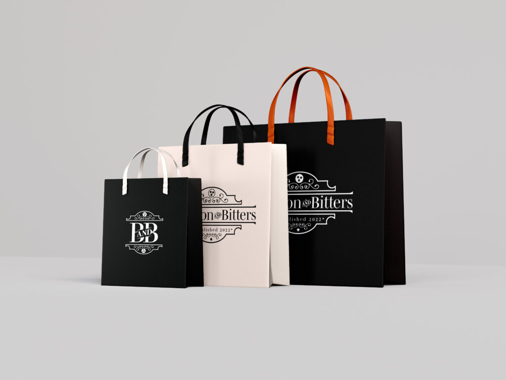
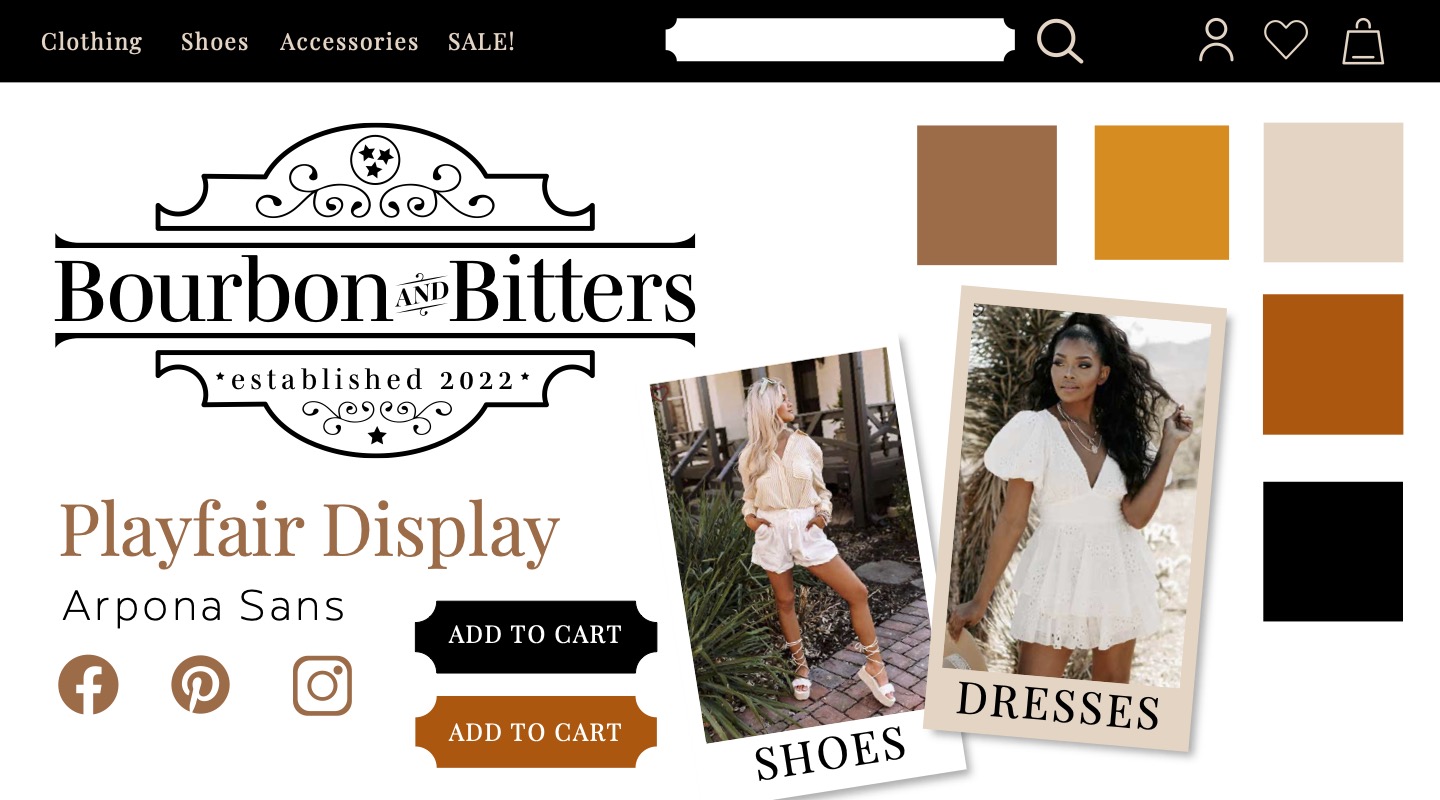
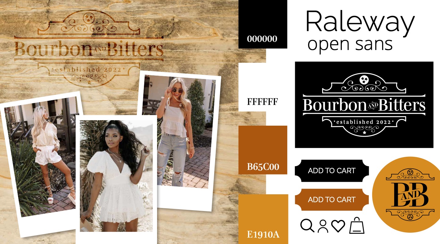
The shape of the B+B logo is intended to mimic that of the traditional saloon signs that can be found in downtown Nashville. To pay homage to the boutique’s Tennessee origins, I made sure to include the triple star from the state flag at the crown of the logo. I used a serif font to exude a sophisticated elegance while still having a southern flair.
Project summary :
Inspired by the iconic Old Fashioned, a cocktail mixed with whiskey, sugar, and bitters, this brand was created to represent the perfect pair. Whether it be leopard print with denim, wedge heels with boot cut flares, or houndstooth with leather pants, Bourbon and Bitters has the perfect combination for any customer!
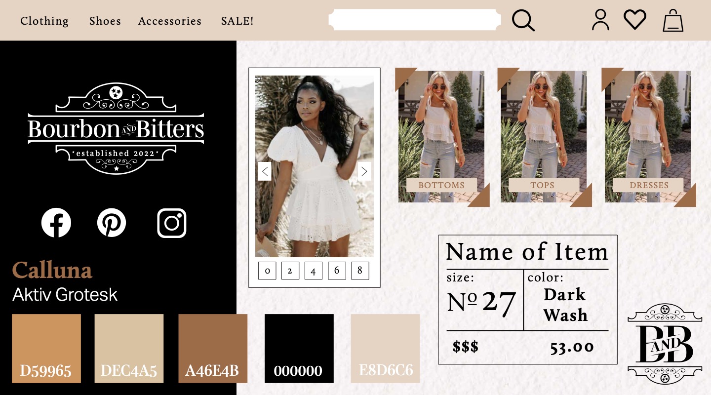
- Inspiration from Jack Daniels Tennessee Whiskey
- Warm, buttery colors
- Embellished, western accents
- Organic textures such as paper or wood
- Using black for a luxurious feel while keeping the brand accesible with casual photography and models.
Client Details
Created for a class project at James Madison University
Service Provided
Branding and Logo Design
Tools Used
Adobe Illustrator
My Other Projects
Like what you see? There’s more where that came from…
