A Closer Look...
CityQuest Brand + Logo Development
Branding:
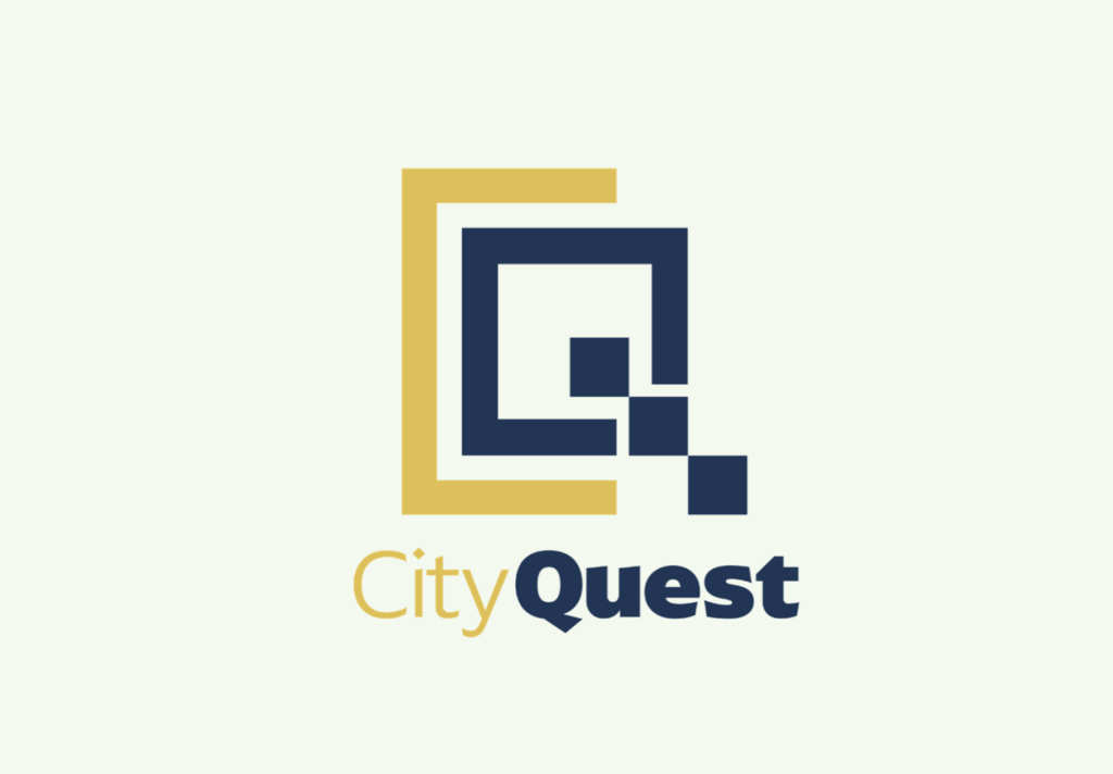
When branding CityQuest, I wanted to focus on three words: Exciting, Clean, and Bold. The user should feel energized, ambitious, and curious while using the app, so I chose a deep blue and gold as CityQuest’s primary colors. The color blue is traditionally used to evoke a sense of trustworthiness and dependability, while also representing aspects of the sky and sea. When combined with gold, an earth toned metal, this color combination represents the intersection between land and water, much like Washington D.C.’s rich history of utilizing the Potomac River as a natural resource. Gold is also the color of prestige and success, paying homage to competitive aspect of CityQuest as a gameplay app.
Logo:
Client Details
The branding and logo for CityQuest were designed as part of a project for my Digital Media II class at James Madison University.
Service Provided
Logo development, Branding
Tools Used
Adobe Illustrator
My Other Projects
Like what you see? There’s more where that came from…