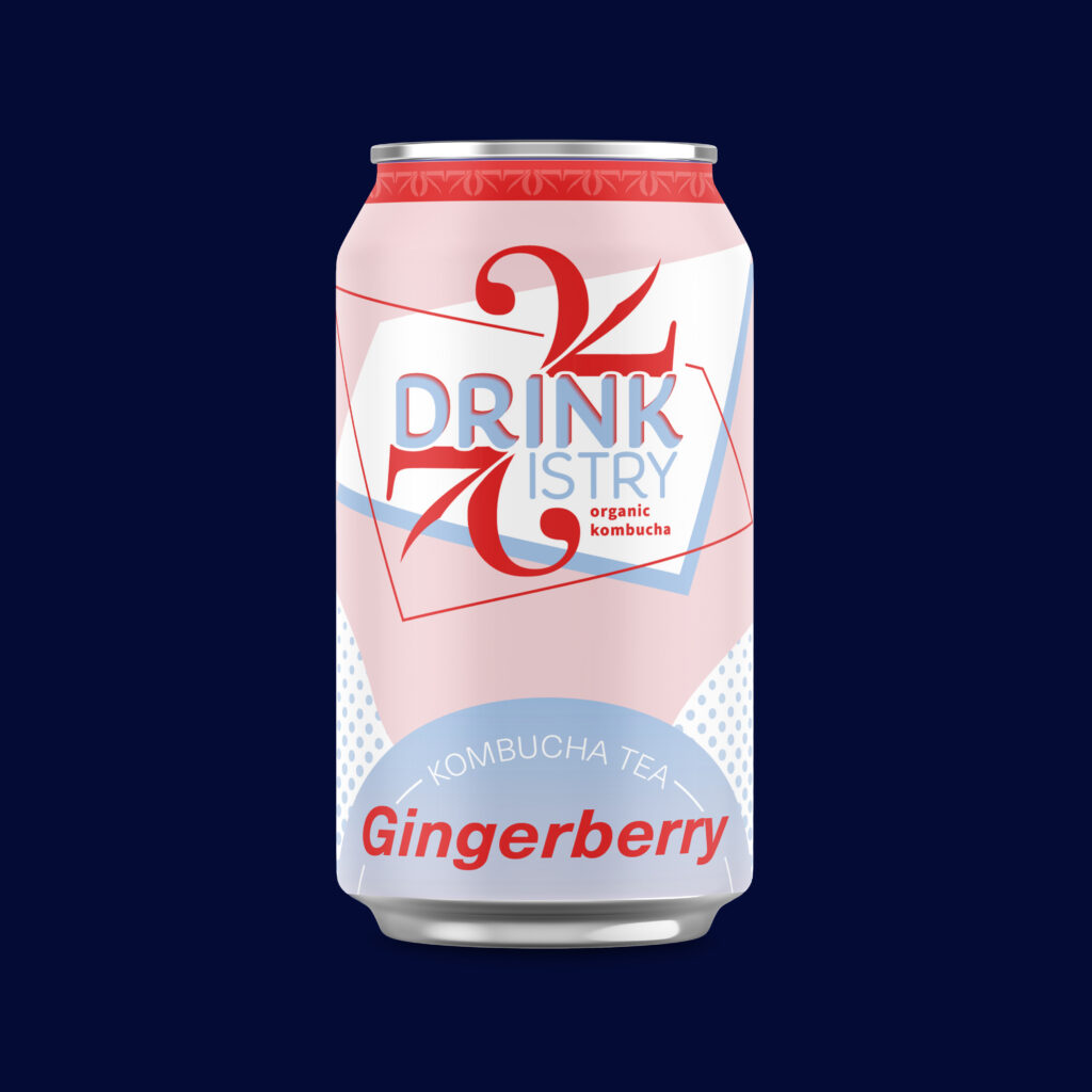
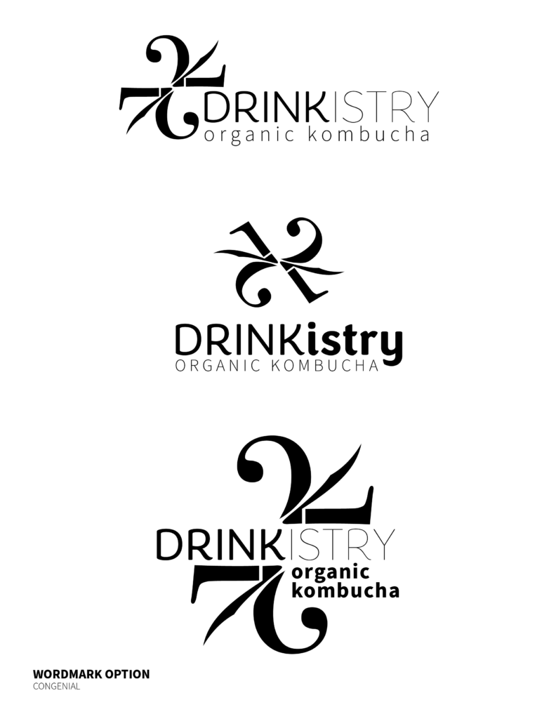
Drinkistry is an organic kombucha brand I developed that embodies the intersection between the ideas of “drink” and “chemistry”. The wordmark combines type with the movement and effervescence of Kombucha. The symmetry of the reflected lines create a sense of completeness and draw the eye inward toward the type.
Drinkistry Product Branding
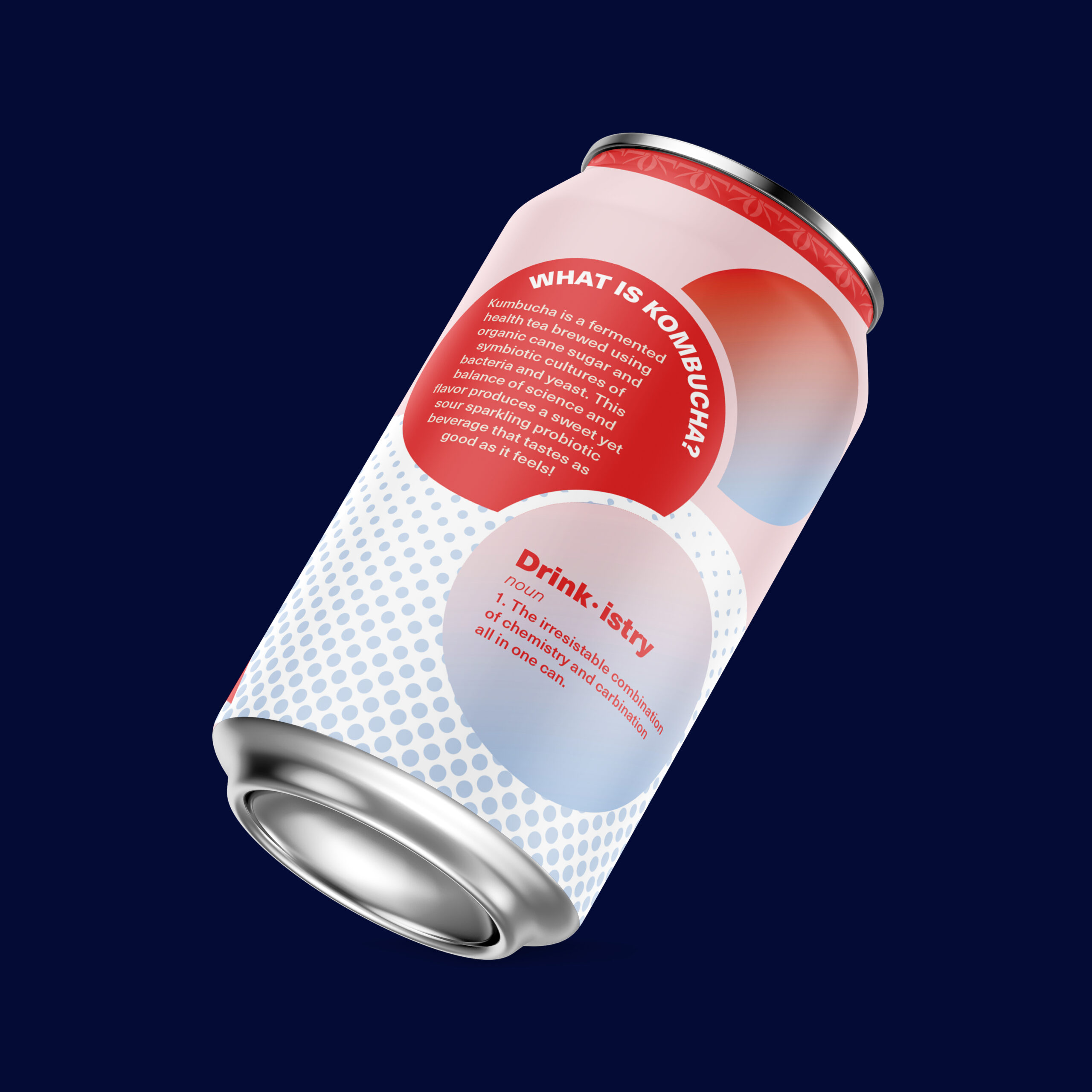
Drinkistry side angle
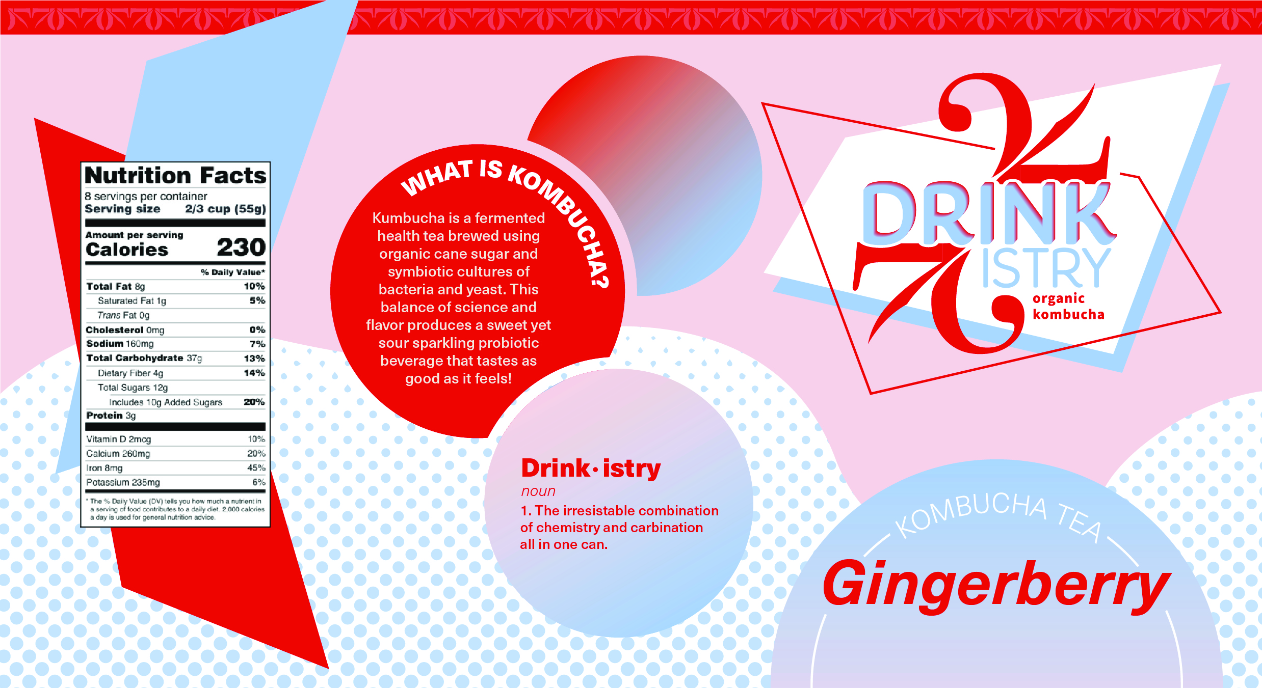
Drinkistry Label
I chose a bright red and a soft blue as the prominent colors to visually manifest the relationship between beverages and chemistry. Both are uniquely different, however, when combined, they make a cohesive fun product. The red grabs the attention of the consumer and the blue welcomes them to take a sip. The rounded bubbles on the can also evoke and sense of playfulness.
Initial Logo Development
Client Details
I completed this project as part of my Typography I class at James Madison University.
Service Provided
Packaging Design, Product Branding, Logo Development
Tools Used
Adobe Illustrator, Adobe Photoshop
My Other Projects
Like what you see? There’s more where that came from…