A Closer Look...
InterVarsity Social Media Content + Branding
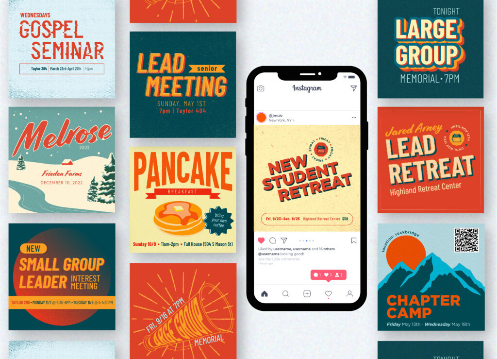
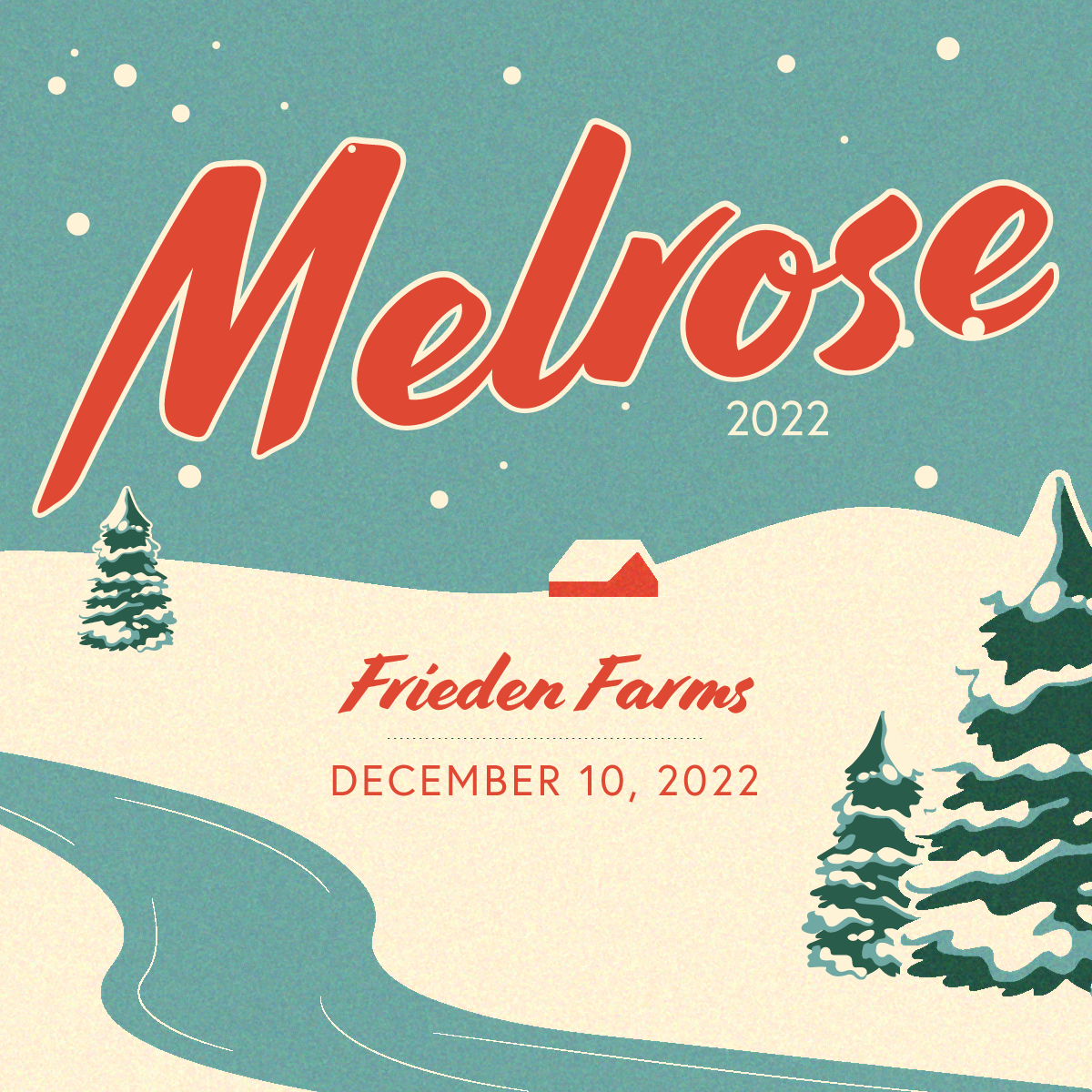
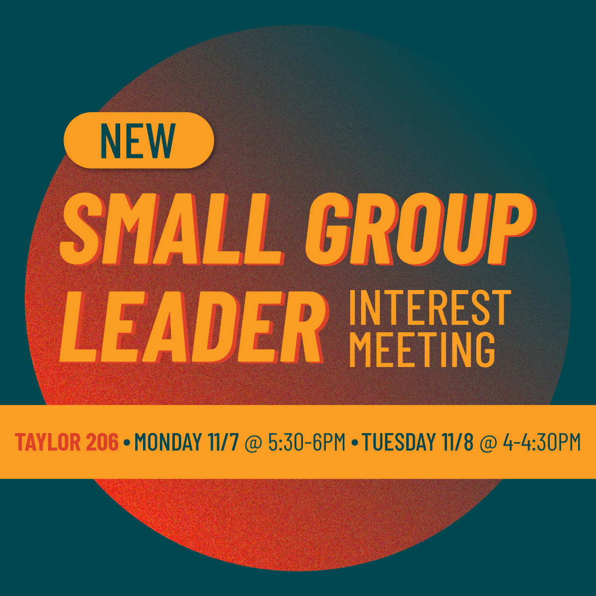
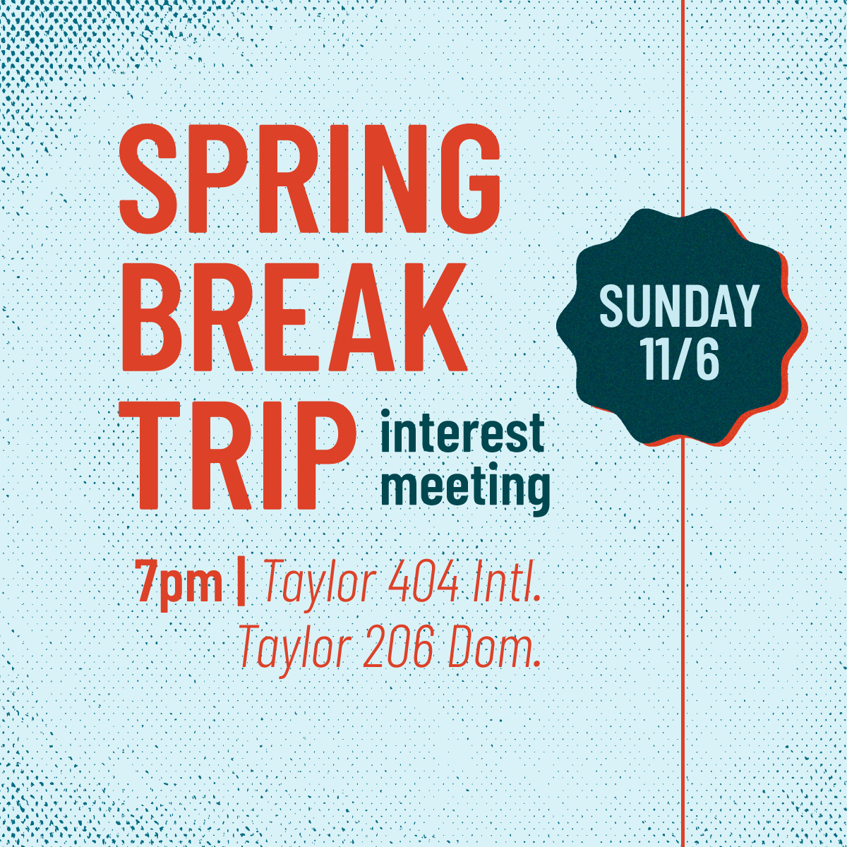
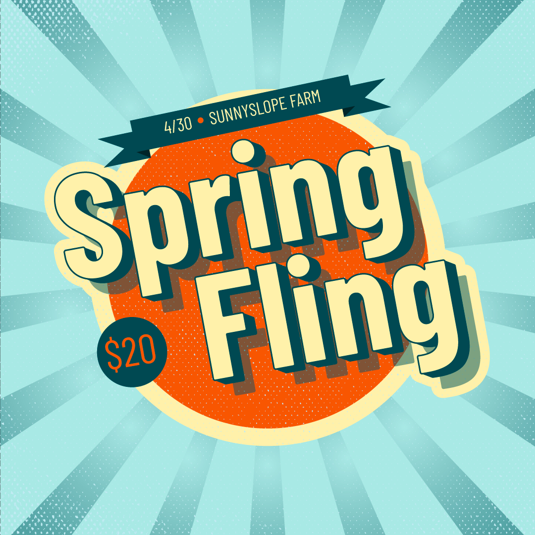
At the beginning of 2022 our new communications team had the opportunity to rebrand InterVarsity’s social media content. I spearheaded the rebrand by reverting back to InterVarsity’s national branding colors of blue and orange. I chose to focus on font treatment as a form of design and used a retro-inspired style to make the orange and blue combination work. Film grain, 3d text, and retro style graphics are the main focus of my rebranding efforts.
Project summary :
Along with a team of 2 designers, I was in charge of creating weekly social media graphics to keep the InterVarsity chapter informed on special events and weekly meetings.







Client Details
JMU InterVarsity
Service Provided
Branding, Content Creation
Tools Used
Adobe Illustrator
My Other Projects
Like what you see? There’s more where that came from…
